
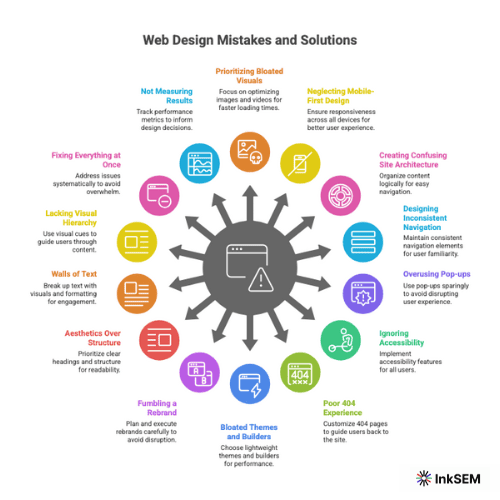
14 Web Design Mistakes Sabotaging Your Google Rankings (And the Prescriptive Fixes)

Your website is failing. If your design choices force a user to wait, pinch-to-zoom, or hunt for a menu, you are actively sabotaging your own business. That frustration isn’t just a bad user experience; it’s a direct signal to Google that your site doesn’t deserve to rank.
The intersection of web design in user experience is no longer a soft metric; it’s a hard ranking factor. User impatience and Google’s algorithms are now intrinsically linked.
The good news is that these are design problems, and they are solvable. This guide provides a blueprint to diagnose and correct the critical design mistakes that are killing your search engine performance.
14 Critical Web Design Mistakes and the Prescriptive Fixes
Prioritizing Bloated Visuals Over Speed
Your choice of a massive, unoptimized hero video or a full-screen 8K image is the primary reason your site is slow. This is a design decision with a severe technical penalty.
Google’s Core Web Vitals mandate that your site must be fast, responsive, and stable. When your design choices slow down LCP (Largest Contentful Paint) or cause CLS (Cumulative Layout Shift), your rankings will drop. No exceptions.
The Fix: Design for “Performance First.”
- Optimize All Images: You must compress every image before uploading. Use modern formats like WebP, which provides superior compression and quality compared to JPEG and PNG.
- Question Every Asset: Does that auto-playing video really improve conversion, or does it just add 5MB to your page load?
- Limit Custom Fonts: Using more than 2-3 custom font families adds significant load time.
- Lazy Load Below-the-Fold Media: Your design should only load images and videos when they are about to enter the viewport.
Neglecting Mobile-First Design
This is non-negotiable. Google uses mobile-first indexing. This means your mobile site is your primary site for ranking purposes. A “responsive” design that is simply a shrunken-down version of your desktop site is a failure.
You must also consider users who aren’t on a stable, high-speed connection. This includes international travelers relying on varied global connectivity solutions or domestic users in areas with poor service. Your mobile site must be lightweight and fast for everyone.
The Fix: Design for the Thumb.
- Test on Real Devices: Do not rely on desktop emulators. You must see how your design feels and performs on an actual phone.
- Ensure Large Tap Targets: Buttons and links must be easily tappable. If a user has to “fat finger” a link, your design has failed.
- Check Readability: Text must be perfectly legible without zooming.
Creating Confusing Site Architecture
If a user, or a Googlebot, can’t find your most important content, it may as well not exist. A confusing Information Architecture (IA) frustrates users, kills conversions, and prevents search engines from properly indexing your site.
The Fix: Implement the “Three-Click Rule.”
- Your Goal: A user must be able to reach any important page (like a core service or product) from your homepage in three clicks or less.
- Design Logical Silos: Organize your content into clear, intuitive categories that reflect how your customer thinks, not how your company is structured.
- Use Clear Internal Links: Design your content to link to other related content. This passes authority and helps users discover more.
Designing Inconsistent or “Clever” Navigation
Users expect navigation to be predictable. When you hide your main menu behind a “hamburger” icon on a desktop screen, or use abstract icons without text labels, you are creating unnecessary friction. “Clever” design that confuses the user is bad design.
The Fix: Prioritize Clarity Over Creativity.
- Make Links Obvious: Links must be visually distinct. Use a combination of color and underlining to signify clickability.
- Use Standard Navigation Patterns: Stick to top-bar or left-sidebar navigation on desktop. Users are trained to look there.
- Label Everything: Do not make users guess what an icon means. Add a text label.
Overusing Pop-ups and Intrusive Interstitials
That full-screen “Subscribe to Our Newsletter” pop-up that appears the second a user lands on your site? Google actively penalizes this. These are called intrusive interstitials, and they create a terrible mobile experience.
The Fix: Be Respectful of the User’s Screen.
- Trigger on Exit, Not Entry: If you must use a pop-up, trigger it on “exit intent” (when the user’s mouse moves to close the tab) rather than on entry.
- Use Banners: On mobile, use small, easily-dismissible banners at the top or bottom of the screen instead of full-screen overlays.
- Test Your CTAs: You will likely find that less-intrusive calls-to-action embedded in the content convert better long-term.
Ignoring Accessibility (A11y)
Designing a site that is unusable for people with disabilities is not just unethical; it’s a legal and financial risk. It also directly impacts your SEO. A site that is hard to navigate for a screen reader is also hard to navigate for a search engine crawler.
The Fix: Design for All Users.
- Check Color Contrast: Your text must have sufficient contrast against its background. Use brand color checking tools to ensure the consistency.
- Design Keyboard-Friendly Navigation: A user must be able to navigate your entire site using only the “Tab” key.
- Use Legible, Resizable Fonts: Do not use tiny font sizes or disable a user’s ability to zoom.
Designing a Poor 404 Experience
Broken links (404 errors) happen. The design mistake is dumping the user on a generic, useless 404 page. This is a dead end. It signals a poor-quality site to both the user and Google.
The Fix: Design Your 404 Page as a Helpful Tool.
- Acknowledge the Error: Clearly state that the page wasn’t found.
- Provide a Path Forward: Your 404 page must include a search bar and links back to your homepage, blog, and top service pages.
- Inject Some Brand Personality: This is the one place you can be a little “clever” and turn a frustrating moment into a memorable brand interaction.
Choosing Bloated Themes and Page Builders
Your choice of a “do-it-all” WordPress theme or a drag-and-drop page builder is a critical design decision that is likely slowing your site to a crawl. These tools often load mountains of unused CSS and JavaScript, killing your performance.
The Fix: Choose a Lightweight Foundation.
- Use a Performance-Focused Theme: Start with a theme built for speed (e.g., Astra, GeneratePress, Kadence).
- Be a Minimalist: Every new plugin, widget, or feature you add to your design comes with a performance cost.
- Audit Your Plugins: Deactivate and delete any plugins that are not absolutely essential to your site’s function.
Fumbling a Website Rebrand
A site redesign or rebrand is one of the most dangerous moments for your SEO. Many businesses launch a beautiful new site only to see their organic traffic collapse. This happens when the design team changes the URL structure without telling the development team.
The Fix: Create a 301 Redirect Map.
- Preserve URLs: Do not change your URL structure unless there is a critical business reason to do so.
- Map Every Old URL: If you must change URLs, your design plan must include a 301 redirect map that links every old page to its new equivalent.
- Do Not Delete Old Content: If a page is getting traffic, do not delete it. Redirect it.
Designing for Aesthetics, Not Structure (Bad Headings)
Using heading tags (H1, H2, H3) to style text because it “looks good” is a fundamental mistake. Headings create the semantic structure of your page. They tell Google and screen readers what your content is about and how it’s organized.
The Fix: Follow a Strict Hierarchy.
- One H1 Tag: Use this only for the main title of the page.
- H2 Tags: Use these for the main sub-sections.
- H3-H6 Tags: Use these to nest content logically within your H2 sections.
- Use CSS for Styling: If you want text to be big and bold, use a CSS class; do not use an H2 tag.
Creating “Walls of Text”
People do not read on the web; they scan. Your design is responsible for presenting content in a digestible way. A massive, unbroken block of text is impenetrable and guarantees a high bounce rate.
The Fix: Design for Scannability.
- Use Short Paragraphs: No more than 3-4 lines each.
- Use Bolding: Embolden key takeaways to draw the eye.
- Embrace White Space: It is not “wasted” space. It is a critical design element that reduces cognitive load.
Lacking a Clear Visual Hierarchy
If everything on your page is screaming for attention, nothing gets attention. A design that doesn’t guide the user’s eye means they won’t know what to read first, what’s most important, or where to click.
The Fix: Guide the User’s Eye.
- Size: Your most important element (like your H1 or CTA button) must be the most visually prominent.
- Color: Use your brand’s action color only for interactive elements like buttons and links.
- Placement: Place your primary call-to-action “above the fold” where users will see it without scrolling.
Trying to Fix Everything at Once
Seeing this list can be overwhelming. Trying to redesign your entire site at once is a recipe for failure. You’ll introduce new bugs and won’t know which changes actually moved the needle.
The Fix: Triage Based on Impact.
- Start with the “Money Pages”: Prioritize design fixes on your highest-traffic or highest-converting pages.
- Focus on Speed & Mobile: These two areas deliver the fastest and most significant SEO returns.
- Use Free Tools: Start your diagnosis with Google PageSpeed Insights. It provides an explicit, prioritized punch list.
Making Design Changes Without Measuring Results
Making “improvements” based on your opinion isn’t optimization; it’s guessing. You cannot know if your new design is helping or hurting unless you have a baseline.
The Fix: Establish a Baseline and Track KPIs.
- Before You Start: Record your key metrics: organic traffic, bounce rate, Core Web Vitals scores, and conversion rates.
- A/B Test: Use tools (like Google Optimize, now part of GA4) to test design changes. Test your new button color against the old one and let the data decide the winner.
- Track Post-Change: You should see measurable results from technical design fixes (like speed) within 2-8 weeks.
Also Read: Web Design Techniques to Boost E-Commerce Platform Conversion Rate
Your Blueprint for Action
You now have a clear blueprint. These are not cosmetic suggestions; they are fundamental design corrections that directly impact how users and search engines perceive your site.
Stop sabotaging your own success. Start with your biggest problem — likely mobile performance or page speed — and use the free tools available to get a diagnosis today. Track your results, iterate, and build a site that earns its rank.