Colors That Sell: 10 Best Colors to Sell Your Stuff More

Colors convey sensations, which is why companies must ensure that their corporate image and logo are in sync with their values. Red is the color of power, blue is calming, and orange is associated with energy. The Colors play a key role in building a brand image and selling more products. People are visual creatures, and if they try to sell us elegance and distinction with colors like pink or yellow, few of us will take the bait. This article explores the list of best colors that sell more if you run your tiny multi-place business.
We propose reviewing the different colors and their associated values, which are not always obvious.
10 Best Colors to Sell Your Stuff More
Color values: Red
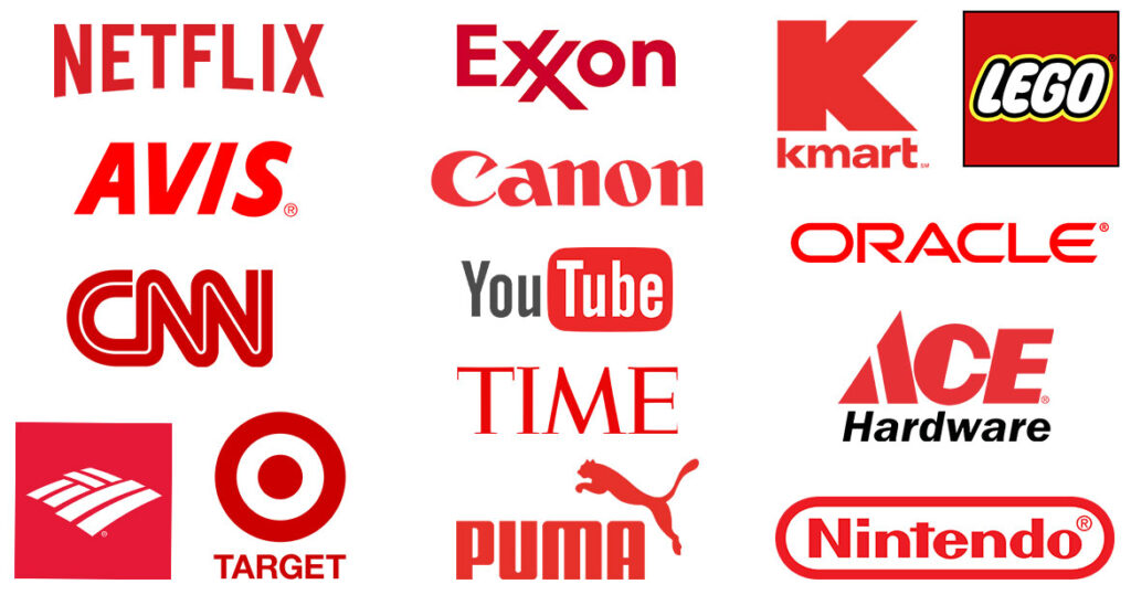
Red is the color of power. Attracts and holds people’s attention. In addition, it is the color of sensuality and sex, of blood and danger. It is the most used color in marketing. So don’t overdo it!
Color values: Blue
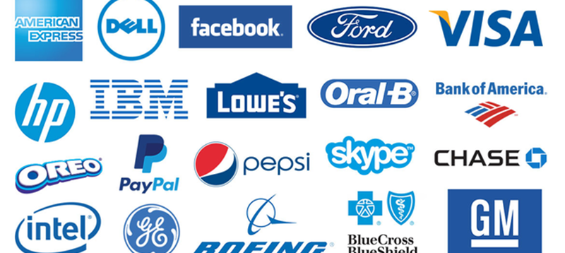
Blue is a relaxing color; it transmits calm and confidence. It is the color of the sky and the water. Humans distinguish more shades of blue than any other color, so depending on the shade used, the results will vary. The darker tones represent elegance, success, and authority; the clearest, youth and freshness.
Also Read: B2B Marketing Meaning?
Color values: Green

Green represents nature, which is why it is used to transmit environmental values. Green is also the color of good health and good intentions. It is very versatile, always pleasant, and transmits good vibes. If you’re not sure what color to choose, it’s hard to go wrong with green.
Color values: Yellow
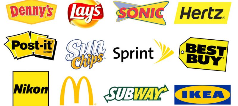
Yellow is a risky color to make a logo. On the one hand, it is very bright and eye-catching, and it symbolizes joy, light, curiosity, and happiness. On the other hand, it can also be associated with cowardice, bad luck, and mistrust. It tends to work best as a complementary color, but if yellow is used as a corporate color and done well, the brand is sure to stand out from the crowd. Choosing colors is perhaps one of the most important things in logo creation.
Color values: Orange
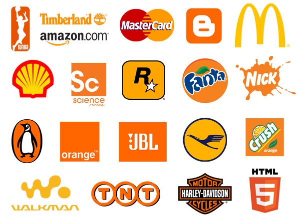
The orange is pure energy. It is widely used to promote sporting goods, energy drinks, and vitamins. Used in other areas, it is associated with youth and innovation. The problem is that traditional companies are abusing that orange to make them look young and confident, so it no longer has the magical rejuvenation effect it once did.
Color values: Lilac
It is the color of royalty, mystery, and spirituality. Feminist movements have also adopted it, incorporating its values. In any case, it is elegant and, at the same time, both cold and warm. A touch of lilac adds prestige to corporate materials. If it is used as the main color, there is a risk of being associated with feminine values.
Also Read: Explore Why the Sales Funnel is Important
Color values: Pink
Flowers, strawberry gum, unicorns. Pink is the color of childhood, femininity, and innocence. It is a color that attracts young girls; it is bright, playful, and cheerful. It is closely associated with the female world, which is not very useful for attracting men, but lately it has been gaining strength, perhaps because of its striking nature.
Don’t forget that there are always exceptions to the rule. In some countries, like Thailand, pink is a masculine color. Men wear pink and buy pink accessories for cell phones and laptops. Even taxis are pink!
Color values: Brown
It is the color of earth and wood, conveying simplicity and warmth. It is the color we are most used to seeing, which makes it the least striking of all. Also, it is used by well-established companies and by many in the construction and legal sectors because it conveys simplicity, neutrality, and warmth.
Color values: White
It is the universal color of peace and purity. Since it is often confused with the background, it is almost always used in negative space.
Also Read: SQM Club: What it is, Facts and Benefits
Color values: Black
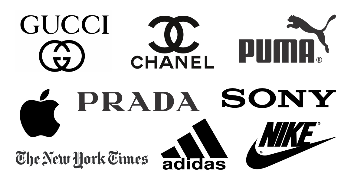
Elegant and simple. Black is a very versatile color, suitable for both traditional and modern companies. If used to contrast with another color, it tends to dramatize the sensations our color evokes.
Are you interested in learning more about colors and marketing? Keep reading…
